Chatbot Button Placement: Research Backed Rules and 5 Metrics to Test
Follow NN/g and Baymard research to place your chat launcher without blocking mobile controls. Includes accessibility checks and five metrics to A/B test.

Place your chatbot launcher in the bottom-right corner as a tested default, since that is where most visitors look first and where usability research finds it least disruptive. Adjust from there for mobile screen collisions, accessibility target sizes, and pages where a contextual link works better than a floating icon. Below, you will find platform-specific rules, an accessibility checklist, and ways to test and measure what actually works on your site.
TL;DR:
- Chatbot launchers are best placed in the bottom-right corner, aligning with user expectations established by common website conventions.
- On mobile, avoid sticky chat buttons that block essential controls like autocomplete or checkout elements, especially during key steps like payment.
- A minimum target size of 24 by 24 pixels is required by WCAG, but 44 by 44 pixels is recommended for better accessibility and touch accuracy.
- Auto-opening chat windows on page load disrupt user tasks and should be avoided, encouraging visitors to initiate conversations themselves.
- Testing placement and prompts through A/B experiments and tracking metrics like impressions, open rates, and conversions ensures placement effectiveness.
Table of Contents
- Why the bottom-right corner is the tested default
- Desktop implementation: launcher behavior, labeling, and collision avoidance
- Mobile placement: safe defaults, common pitfalls, and alternatives
- Accessibility checklist: target size, keyboard focus, and labels
- Combine floating launchers with contextual CTAs and in-page routes
- How to measure, A/B test placement, and safeguard performance
- Considerations for internationalization and language differences
- Common placement mistakes and how to avoid them
- Konvuno’s take on placement in practice
- Try chatbot placement that adapts to your site
- FAQ
- Sources
Why the bottom-right corner is the tested default
Bottom-right earns its reputation through habit, not magic. Usability research from Nielsen Norman Group found that users expect a chat launcher there, and floating buttons placed elsewhere were often missed entirely in testing. That expectation comes from years of software and website conventions: shopping carts, notification bells, and help widgets have trained people to scan that corner first.
Convention matters because it removes a decision. A visitor who needs help does not have to hunt for your chat icon if it sits where every other site puts theirs. That said, bottom-right is a starting point, not a rule carved in stone. Several common page elements compete for the same real estate and justify moving the launcher:
- Cookie consent banners that dock at the bottom of the screen
- Cart preview drawers or “added to cart” confirmations
- Accessibility toolbars or language switchers anchored in the same corner
When any of these overlap your default position, shift the launcher or stagger its appearance rather than letting two fixed elements fight for the same pixels.
Desktop implementation: launcher behavior, labeling, and collision avoidance
On desktop, a floating launcher works well for general-purpose availability, while an inline link or footer route often serves better on pages where help requests are predictable, like billing or returns policies. The goal is a launcher that is easy to notice without getting in the way of anything else on the page.
A few implementation rules keep the launcher functional across screen sizes:
- Use strong contrast against your background so the icon reads instantly, not just on close inspection.
- Label it clearly: “Chat” or a task-specific phrase like “Ask about pricing” outperforms an unlabeled bubble icon.
- Keep a visible, easy-to-find close control so visitors never feel trapped by an overlay.
- Offset the launcher with CSS margins so it never overlaps footers, cookie notices, or sticky promotional bars.
Test the launcher at common breakpoints, not just your primary desktop resolution. A position that looks fine at 1920 pixels wide can collide with a sidebar or footer at 1366.
Pro Tip: Check your launcher against every fixed-position element already on the page before shipping; a quick visual audit at three or four screen widths catches most collisions.
Mobile placement: safe defaults, common pitfalls, and alternatives
Mobile is where chatbot placement goes wrong most often. Research from the Baymard Institute found that sticky chat launchers frequently block autocomplete suggestions, color swatches, filter bars, and checkout controls on small screens, turning a helpful feature into an obstacle.
Follow a short sequence to avoid the same mistakes:
- Map every sticky or fixed element already on your mobile layout, including bottom navigation bars and persistent “add to cart” buttons.
- Position the chat launcher so it never overlaps those elements, adjusting its vertical offset per page type if needed.
- Avoid auto-opening the chat window on page load. Baymard’s research and general accessibility guidance both point to letting the visitor initiate the conversation, since unexpected overlays interrupt tasks and feel intrusive.
- On pages with heavy interactive controls, like product listings or checkout, consider suppressing the floating launcher entirely and offering a footer link or inline contextual prompt instead.
- Reassess placement after any major layout change, since a redesign can quietly reintroduce a collision that testing once ruled out.
A hybrid approach tends to work best: keep a persistent launcher for general availability, but add inline or footer routes on pages where people are actively looking for help, such as product details or pricing. This preserves discoverability without risking obstruction on the pages most prone to it.
Pro Tip: If your mobile checkout flow has any sticky controls, hide the floating launcher on that step and rely on an inline “Need help?” link instead.
Accessibility checklist: target size, keyboard focus, and labels
A launcher that looks fine visually can still fail basic accessibility checks. WCAG 2.2 sets a minimum pointer target size of 24 by 24 CSS pixels, with some spacing exceptions, and that figure is the floor, not the goal.
For a control as frequently used as a chat launcher, aim higher. The W3C recommends 44 by 44 pixels for important controls where feasible, which gives visitors with limited dexterity or those on touchscreens a far more reliable target.
Beyond size, run through a short checklist before launch:
- Confirm the launcher is fully keyboard operable, including opening and closing the chat window.
- Give it an accessible name via ARIA labeling, not just a visual icon.
- Add scroll-padding or similar CSS adjustments so the widget never hides content when keyboard focus moves to an element behind it.
- Verify there is no focus trap once the chat window opens, so pressing Tab or Escape still works as expected.
Combine floating launchers with contextual CTAs and in-page routes
A corner icon is not the only way to offer help, and it is often not the best one. NN/g’s 2026 guidance on AI chatbot design recommends pairing general discoverability with explicit capability signals, such as clickable suggested questions, and keeping the assistant available across the pages where a multi-step journey actually happens.
Contextual placement means putting a chat entry point where the question naturally arises rather than making every visitor find the same corner icon. A few patterns work well:
- On pricing pages, a short inline prompt like “Questions about plans? Ask here” sets expectations before the visitor even opens the chat.
- On product pages, a catalog-aware prompt such as “Ask about sizing or availability” signals the assistant can actually help with that specific page.
- On policy or support pages, a footer link labeled “Chat with us about returns” avoids competing with a floating launcher that may already be present elsewhere.
Consolidate these into a single entry point per journey so visitors are not juggling multiple competing triggers as advised in the Customer-Support Bot System Prompt. Task-specific prompt copy, rather than a generic “Chat with us,” reduces hesitation and sets a clearer expectation of what the assistant can do.
How to measure, A/B test placement, and safeguard performance
Placement decisions should rest on data from your own traffic, not just general convention. Track a specific set of metrics before and after any change:
- Launcher impressions and open rate, to see whether visitors notice and engage with it.
- First-message rate, which shows whether an opened chat actually gets used.
- Qualified leads and resolved intents, separated from raw conversation counts.
- Handoffs to a human agent, which flag where automated answers fall short.
- Page-level conversion lift and any obstruction complaints, especially on mobile.
IBM’s chatbot-design guidance recommends measuring interaction metrics and business outcomes separately by device, since a launcher that raises impressions without raising conversions can be misleading on its own.
A short set of A/B tests covers most of the open questions:
| Test | What it compares |
|---|---|
| Position | Bottom-right versus bottom-left launcher |
| Format | Floating icon versus inline contextual link |
| Loading | Always-on versus deferred widget load |
| Labeling | Labeled icon versus unlabeled icon |
On performance, a third-party study on live-chat widgets and Core Web Vitals found possible differences in Largest Contentful Paint when widgets load automatically on every page. A lightweight launcher facade that defers the full chat application until the visitor interacts with it is worth testing against a fully loaded widget on your own site.
Considerations for internationalization and language differences
Button placement rarely changes by language alone, but the content and layout around it often do, and that affects where a launcher can safely sit. Right-to-left languages like Arabic or Hebrew mirror the entire page layout, which can flip where navigation, carts, and other fixed elements sit relative to a bottom-right launcher. Testing placement only in a left-to-right layout risks shipping a collision that only shows up once the site is localized.
Label length is another practical concern. A short English label like “Chat” can turn into a noticeably longer phrase in German or Finnish, which may require a wider launcher button or a switch from text-plus-icon to icon-only on narrower screens. Build the launcher’s container with flexible width rather than a fixed pixel size so translated labels do not get clipped or wrap awkwardly.
Regional conventions for help-seeking also vary. Some markets expect a phone number or email link alongside chat, while others treat chat as the default first contact. Where you serve multiple regions, consider letting the contextual prompt copy adapt per locale rather than forcing a single global phrase to cover every market.
Finally, test keyboard and screen reader behavior in each language your site supports, since accessible names and ARIA labels need translation too. A launcher that is properly labeled in English but silent or mislabeled in another language fails the same visitors it was meant to help.

Common placement mistakes and how to avoid them
Most chatbot placement problems come from treating the launcher as an afterthought rather than part of the page layout. A handful of mistakes show up repeatedly.
Auto-opening the chat window on page load is one of the most common and most damaging. It interrupts whatever the visitor came to do and often gets closed immediately, wasting the one chance to make a good first impression. Let visitors open the chat themselves.
Stacking the launcher on top of other fixed elements is another frequent issue, particularly on mobile, where bottom navigation bars, sticky add-to-cart buttons, and cookie banners all compete for the same strip of screen. Audit every fixed-position element on a page before deciding where the launcher goes, not after.
Using the same placement and copy across every page regardless of context misses an easy opportunity. A generic “Chat with us” bubble on a pricing page does less work than a prompt that specifically mentions plans or pricing questions.
Skipping accessibility checks is easy to overlook until a complaint or audit surfaces it. A launcher smaller than the recommended target size, or one that traps keyboard focus once opened, can quietly exclude a meaningful share of visitors.
Finally, launching without a measurement plan means you will never know whether a placement change actually helped. Track impressions, opens, and first-message rate from day one so any later change has a baseline to compare against.

Konvuno’s take on placement in practice
Placement rules only matter if the assistant behind the button is useful once opened. We built an AI website assistant for small and medium businesses that installs through a single script tag, so testing a new launcher position or contextual prompt does not require a developer sprint.
Because the assistant answers from a business’s own FAQs, website content, and synced product catalog, contextual prompts on product or pricing pages can reference real, current information rather than generic copy. Multilingual support across several languages and a hosted dashboard mean the placement and prompt adjustments described above stay manageable for a site owner working alone or through an agency.
— Konstantin
Try chatbot placement that adapts to your site
Testing bottom-right versus contextual prompts, or floating versus inline links, is far easier when configuration lives in a dashboard instead of a codebase. With Konvuno, you install one widget, then adjust prompts, placement behavior, and catalog-aware answers without touching a developer queue.
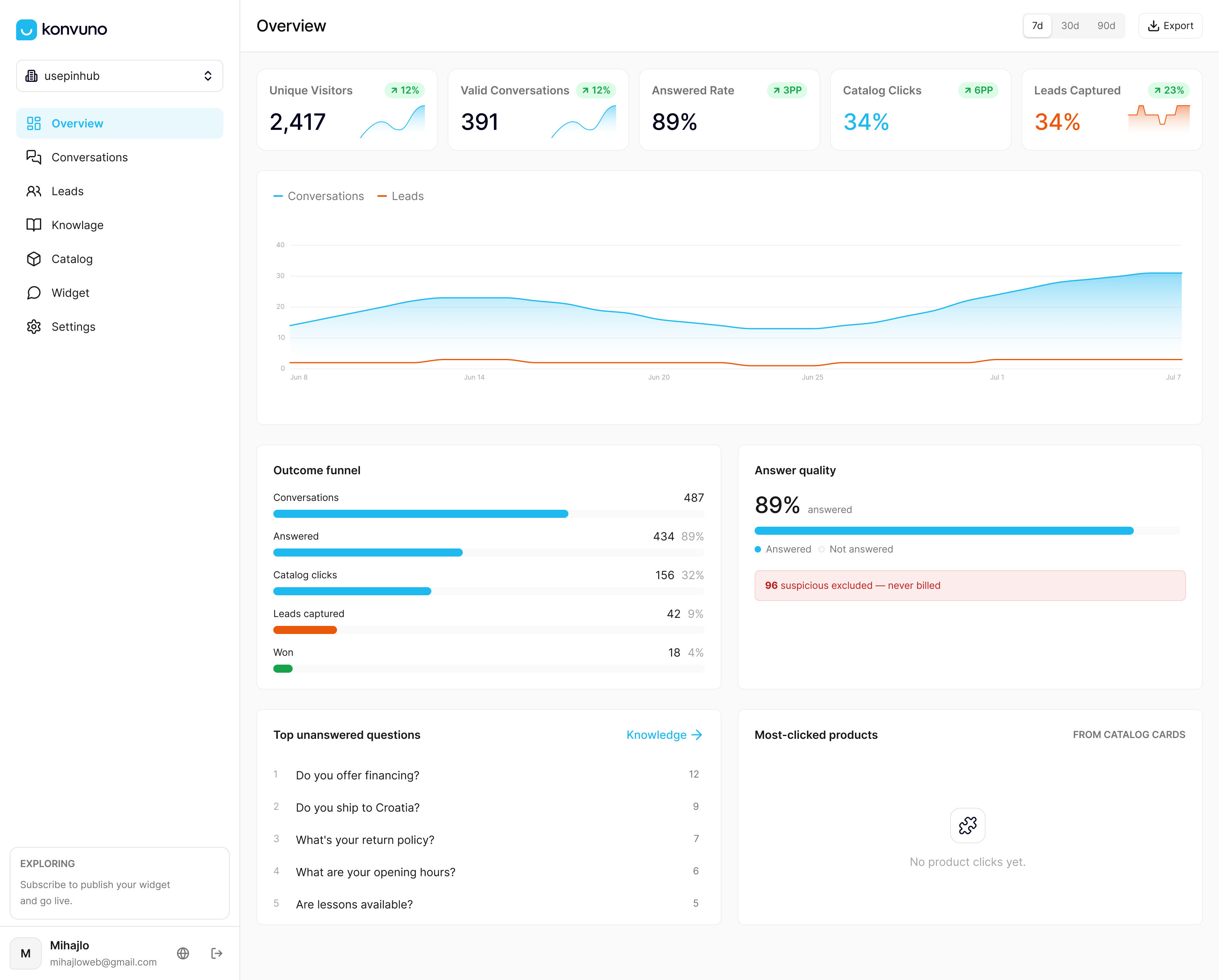
Catalogs sync automatically from WooCommerce or a Google Merchant or Facebook feed through Shop Connect, so product-page prompts stay accurate without manual updates, and FAQ-driven answers through our FAQ Assistant reduce how often visitors need the floating launcher at all. Compare the Starter, Growth, and Business plans and see which fits your site’s current traffic and catalog size.
FAQ
Should the chat button go on the left or right side?
Right is the stronger default, since NN/g usability testing found that users commonly expect chat there and often miss launchers placed on the left. Test a left-side variant only if your layout has a strong reason, like a right-side cart drawer or navigation panel.
Should the chatbot open automatically when someone visits a page?
No. Baymard’s research and general accessibility guidance both recommend letting the visitor initiate the chat, since an auto-opened window interrupts the task they came to do and often gets closed without being read.
Is it safe to show a floating chat button on a checkout page?
Generally no, if the launcher risks overlapping payment fields, shipping options, or other checkout controls. Baymard’s usability testing found sticky chat frequently obstructs these elements on mobile, so a footer link or temporary suppression works better on checkout steps.
How small can a chat button be and still meet accessibility standards?
WCAG 2.2 sets a minimum pointer target size of 24 by 24 CSS pixels, with some spacing exceptions. For a frequently used control like a chat launcher, aim for 44 by 44 pixels where your layout allows it.
What is the basic architecture behind a website chatbot?
Most chatbots combine a knowledge source, such as FAQs or website content, with a way to match visitor questions to that content and a fallback path to a human agent. IBM’s chatbot-design guidance emphasizes defining what the bot actually knows before deployment, since placement cannot make up for thin content coverage.
Sources
- The User Experience of Customer-Service Chat: 20 Guidelines - NN/g
- These Three (Popular) Approaches to Implementing ‘Live Chat’ are Often Highly Disruptive for Users - Baymard
- Understanding Success Criterion 2.5.8: Target Size (Minimum) | WAI | W3C
- IBM chatbot-design guidance