Appearance — colour, theme, size and position
Make the widget look like part of your website — brand colour, light or dark theme, launcher text, panel size and where it sits on the page.
On the Appearance tab you decide what the widget looks like. The preview on the right redraws with every change, so you can try options until it feels right.
Brand colour
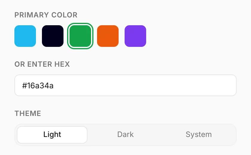
Primary color colours the round launcher, the chat header, the send
button and the suggested questions. Pick one of the swatches, or type your own colour in
Or enter hex — a six-digit code such as #16A34A, with or without the
#.
Konvuno picks black or white text on top of your colour automatically, whichever is easier to read, so a very light or very dark brand colour still works.
Tip
Not sure of your brand colour's code? Your logo file, your website's style guide or whoever designed your website will have it. Until you know it, one of the swatches is a safe choice.
Theme
Theme switches the chat panel between Light and Dark backgrounds. System follows each visitor's own device setting, so people who use dark mode get a dark chat and everyone else a light one.
Pick the one that matches your website's background, or System if your site has both.
Bubbles, launcher text, size and position
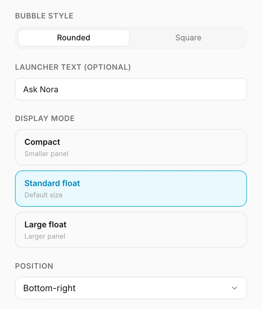
- Bubble style — the shape of the message bubbles: Rounded or Square.
- Launcher text (optional) — a short line in a speech bubble next to the launcher, such as "Questions? Ask us". Up to 40 characters. It invites people to click and disappears while the chat is open. Leave it empty for just the round button.
- Display mode — how big the chat panel is on a computer screen: Compact, Standard float or Large float. Choose a larger panel if your answers tend to be long, or a smaller one if the widget would cover important parts of your pages.
- Position — the corner or edge the launcher sits on. Bottom right is where most visitors expect a chat. Move it if something on your site already lives there, such as a cookie banner or a "back to top" button.
On phones
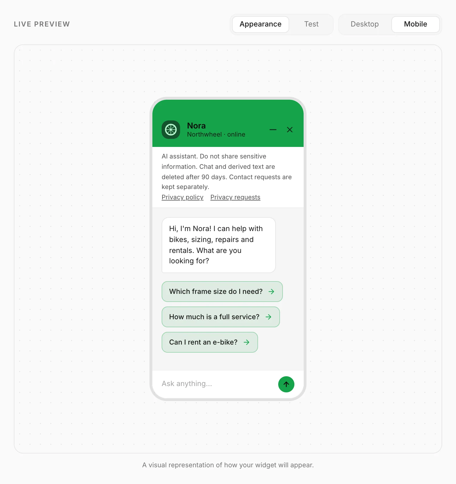
On a phone the chat always opens full screen, whatever display mode you pick — a small floating panel is hard to use on a small screen. To see how it looks, switch the preview to Mobile.
How other businesses use it
- A law firm with a dark, formal website picks Dark and leaves the launcher text empty.
- A kids' activity centre uses its bright brand orange and the launcher text "Ask us anything!".
- An online shop moves the widget to the bottom left, because its cart button already sits bottom right.